How Smart Formatting Turns Visitors Into Loyal Readers
A content writer today gets about 3 seconds to win a stranger’s attention. That window is shorter than a traffic light pause in downtown Manhattan. If the page feels crowded, exhausting, or visually chaotic, readers disappear before the message even has a chance to breathe.
When people land on an article packed with dense paragraphs that look like a legal document from the early 90s, the brain experiences what psychologists describe as immediate cognitive overload. The reader does not consciously decide to leave. The brain quietly pulls the emergency brake.
That is why formatting is not cosmetic. It is psychological.
The strongest digital content no longer feels like a “wall of text.” It feels like a series of small, effortless wins. A clean headline. A breathable paragraph. A visual pause. A bolded insight that catches the eye at exactly the right moment.
Good formatting tells readers: “You don’t have to work hard to understand this.”
And in the attention economy, that feeling is priceless.
The Scanner Mentality: How People Actually Read Online
People do not read online the way they read books on a quiet Sunday afternoon.
Web behavior studies conducted by the Nielsen Norman Group using eye-tracking technology revealed a consistent pattern known as the “F-Shaped Reading Pattern.” Users typically scan the top of a page first, move slightly lower for another short horizontal scan, then continue vertically down the page, searching for visual anchors and quick value cues.
In other words, readers are hunting, not studying.
They skim before they commit.
That explains why giant blocks of uninterrupted text feel mentally expensive. The brain naturally associates white space with clarity, comfort, and control. Space is not wasted space. It acts like oxygen inside the reading experience.
Without it, even brilliant ideas can suffocate.
From the “GoViral” perspective, the formula is brutally simple:
Valuable Content + Bad Formatting = Invisible Content
When the presentation collapses, engagement collapses with it. Readers bounce. Retention drops. Even exceptional insights lose their impact.

The Formatting Toolkit: 6 Visual Moves That Keep Readers Hooked
To transform any ordinary text into an enjoyable reading experience, writers must use a set of tools that reshape the article’s visual structure. Below are the six essential tools for professional content formatting:
1. Smart Subheadings That Pull Readers Forward
Subheadings are not labels. They are navigation systems.
A strong article should still communicate its core message even if someone only reads the headlines. Think of headings as the movie trailer of your content. They keep readers oriented while creating curiosity about what comes next.
Using structured H2 and H3 headings also improves content hierarchy for both readers and search engines, making the experience smoother and easier to process.
2. Bullet Points That Turn Complexity Into Clarity
Lists are a magical tool for breaking the monotony of long paragraphs. They help:
- Simplify complex information into digestible points.
- Highlight benefits or steps in an organized manner.
- Increase the reader’s comprehension speed
3. Bold Text That Works Like Road Signs
Bold formatting acts like a visual GPS.
It guides the eye toward the moments that matter most. Key phrases, powerful insights, and strong opening lines become easier to catch during quick scans.
Strategic emphasis helps even distracted readers walk away with the core message.
The keyword here is strategic.
When everything is bold, nothing feels important.
4. Blockquotes That Create Mental Breathing Room
A well-placed quote slows the reader down in the best possible way.
Instead of endlessly scrolling through paragraph after paragraph, readers encounter a visual pause that invites reflection. It changes the page's rhythm and reduces cognitive fatigue, especially in longer articles.
A visually separated quote also gives ideas more authority and emotional weight. Readers instinctively pay attention to information that looks distinct from the surrounding text.
And when the quote comes from a credible source or an industry expert, trust naturally increases. The article begins to feel grounded in expertise instead of sounding like another random internet opinion.
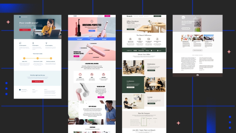
5. Multimedia That Keeps the Page Alive
Research consistently shows that articles with visual elements generate stronger engagement and longer time-on-page. Images, GIFs, videos, and infographics help explain concepts that words alone sometimes struggle to communicate.
A useful rule many content strategists follow is simple:
Include one meaningful visual element roughly every 300 words.
Not because readers are impatient, but because visual variation keeps momentum alive.
Think of it like pacing in a Netflix documentary. Even brilliant storytelling needs scene changes.
6. Short Paragraphs That Respect Mobile Readers
Most people are reading your content from a phone while multitasking, commuting, waiting in line, or pretending to listen during a Zoom meeting.
Huge paragraphs feel exhausting on small screens.
Shorter paragraphs, ideally around three to four lines, create a smoother reading flow and make content feel psychologically lighter. Breaking ideas into smaller sections also improves comprehension and reduces reader friction.
Good mobile formatting feels less like reading a textbook and more like following a smart conversation.
Beyond Words: The Hidden Power of Visual Intelligence
Formatting is not just about organizing text. It is about using visual intelligence to strengthen meaning.
The wrong image can quietly weaken an entire article. Generic stock photos filled with fake smiles and staged handshakes have become the digital equivalent of elevator music. People mentally tune them out instantly.
Original visuals, thoughtful graphics, and purposeful design choices create credibility. They signal effort, professionalism, and attention to detail.
Even white space becomes strategic.
Used correctly, it reduces visual noise around Calls to Action and naturally guides readers toward the next step, whether that means subscribing, booking a consultation, or making a purchase.
Research published by Wichita State University found that thoughtful use of white space significantly improves reading comprehension and reading speed compared to cluttered layouts.
Clean design does not just look better.
It performs better.

How “GoViral” Designs Content People Actually Want to Read?
At “GoViral,” writing is treated as only half of the equation. The other half is delivery.
Every article is approached as a complete user experience, in which SEO strategy, visual hierarchy, and reader psychology work together rather than competing for attention.
The team applies what it calls “Retention Architecture,” a system designed to make content instantly scannable while preserving depth and substance.
That process includes:
- Transforming dry data into easy-to-understand infographics.
- Structuring headings according to Search Intent.
- Improving page loading speed through optimized media compression.
- Building a logical content flow that intelligently guides readers from the introduction to the final conversion button.
This combination increases trust because readers feel something rare online: They feel considered.
When audiences sense that a brand respects their time, clarity, and attention span, loyalty becomes far easier to earn.
The Real Problem Is Often Not the Content
Great formatting functions like silent hospitality. Before readers judge your expertise, your product, or your service, they first judge how easy it feels to engage with your content. When the experience feels smooth and frictionless, trust begins forming quietly in the background.
Many brands do not suffer from weak ideas.
They suffer from exhausting presentations.
The gap between a brilliant message and a lost customer is often nothing more than poor visual delivery.
That is why investing in formatting is no longer optional. It is part of the product experience itself.
Do you already have excellent content that still fails to achieve the engagement you expect?
The missing piece may simply be the “presentation.” The “GoViral” team can help give your blog a professional appearance that reflects the true value of your brand. You can now request a consultation from a specialized “GoViral” expert to build a complete blog and receive a customized content strategy tailored to your website.
It is time to transform casual visitors into loyal readers and dedicated customers by combining the power of words with the magic of visual formatting.
This article was prepared by coach Alaa Manla Ahmad, a coach certified by Goviral.